A Socio-Feminist Approach to Emily Mary Osborn’s Nameless and Friendless

Researched by: Olivia Sims

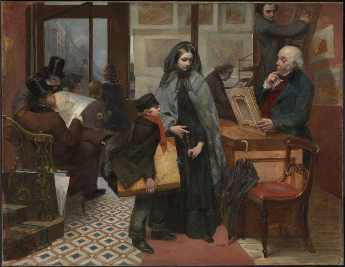
Nameless and Friendless. “The rich man’s wealth is his strong city, etc.” – Proverbs, x, 15 1857 Emily Mary Osborn 1828-1925 Purchased with assistance from Tate Members, the Millwood Legacy and a private donor 2009 http://www.tate.org.uk/art/work/T12936

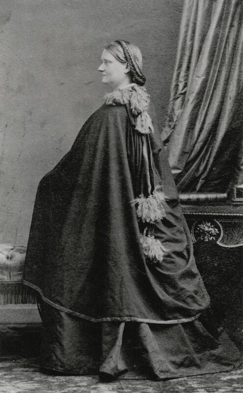
Osborn is one of many notable female artists from Victorian England who was able to make a name for herself in the male-dominated art culture of the time. Osborn spent her early life in Kent and Essex until her family moved to London in 1842. Born as the daughter of a clergyman, Osborn was able to afford training in London to be a genre painter. Osborn chiefly produced genre paintings depicting women and children, which was typical subject matter for women to paint in this time, but Osborn is significant because she encoded the problems women faced in Victorian England in in these types of paintings.[1] She also became an active participant in women’s rights in which she was a member of the Society of Female artists as well as having close connections with feminist (and artist) Barbara Bodichon’s Langham Place circle.

In this genre painting, Osborn depicts a young female artist with her gaze cast downwards, twirling a string in her hand in an art dealer’s shop waiting for the dealer’s decision of whether he will purchase her work. Except for a woman walking out the door, the young artist is surrounded by males all who seem interested in her presence, possibly the reason for her apparent discomfort.


[1] Linda Nochlin, Women, Art, and Power and Other Essays (New York: Harper and Row Publishers, 1988), 88.

To read Olivia’s entire research paper, click here:

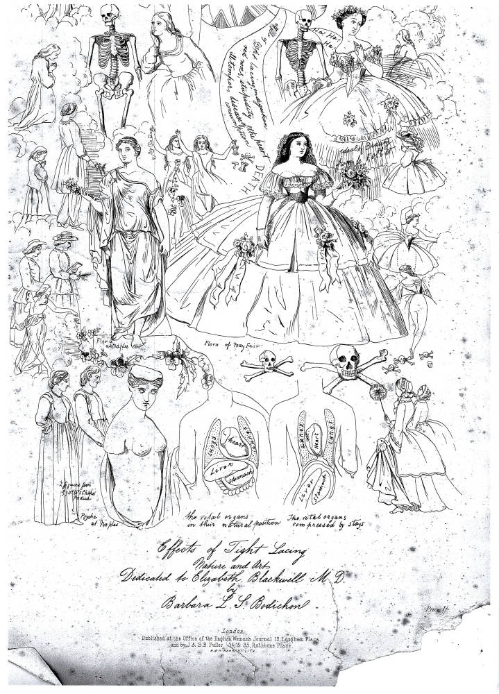
Barbara Bodichon, Effects of Tight Lacing, c. 1858


Researched by: Olivia Sims

Bodichon’s lithograph depicts an artful grouping of figures that are all varying in scale and appearance, including women in differing forms of dress- with some wearing corsets and some not- along with skeletons, depictions of Greco-Roman sculptures, and female anatomical figures in a cloudy, dreamlike setting. The work has no color as it is a lithograph intended to be
printed in a journal, but Bodichon creates a distinct contrast of light and dark by utilizing hashing techniques and a range a line width. Her use of line found in the floral accents, cloud masses, and text bubbles directs the viewer across the page to visual “stops” of figural groups. There is an overriding sense of crowdedness because of the vast quantity of figures and imagery that spans
the width and (most of) the length of the page. The figures are spread out on the page as if they are floating in the clouds and there are multiple interactions taking place within these figural groupings. The lithograph also portrays skull and cross-bone and floral imagery along with various groupings of text. The imagery and text are found floating in space around the figures. The text at the bottom serves as a dedication to Dr. Elizabeth Blackwell and states its publication at the office of the English Women’s Journal.

For more information and to see Olivia’s entire research paper, click here:

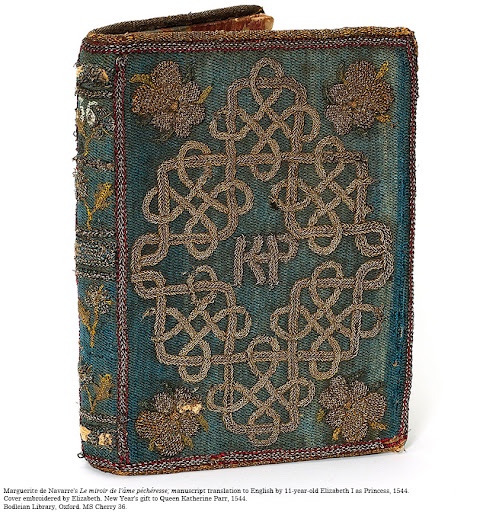
Elizabeth Tudor’s Embroidered Book Cover for The Mirror of the Sinful Soul


Researched by Olivia Sims

This book cover was created in 1544, when Elizabeth was eleven years old, and was given to her stepmother Katherine Parr (1512-1548) as a New Year’s gift. Ellis supposes that Elizabeth likely translated this poem and created this book cover when she was under banishment from the court per the orders of her father, King Henry VIII (1491-1547). This banishment was because Elizabeth apparently offended the king. This embroidered book cover with its translated contents is now in the collections of the Bodleian Library in Oxford.

The background of the cover of this translated poem is worked in a blue silk stitch onto a blue canvas base. The base is outlined with red, gold, and silver braided embroidery. The back of the cover was also embroidered; however, it has worn over time rendering it unusable for
analysis. The eyes are drawn first to the center of the front cover which displays the letters “KP” in gold braided stitching that is embroidered upon the base. Additional gold braiding forms an equilateral cross that surrounds the central monogram. The horizontal ends of the cross inwardly join another braid of the same gold material woven over and under the outside of the cross
pattern to form a square. This central square bisects the vertical ends of the cross outline in the center. The fusion of the cross and square outlines creates four smaller boxes at the corners of the square, each featuring interlacing braided scrollwork. Two additional boxes are located on the vertical ends of the cross-pattern lines. Four pansies at the corners of the cover are detailed in
green, yellow, and purple silk. Other floral imagery appears on the spine of the cover that features four pansies and two bees worked in silver and gold thread.

For more information and to see Olivia’s entire research paper, click here:
Design a site like this with WordPress.com
Get started